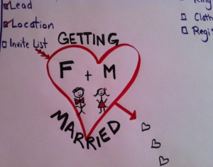
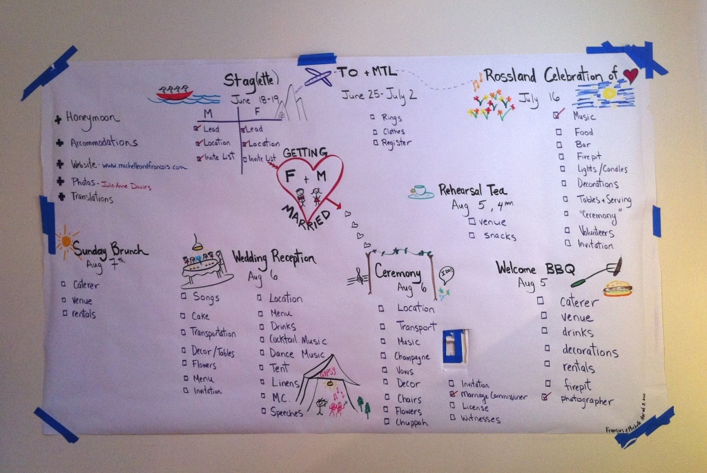
 I decided to redo my first attempt at a graphic to help plan out my wedding for this summer. I have many sub-events within one event that spans a few months and different geographies. My main purpose is to have something for myself in large format to scan and keep me focused. Drawing it out created a calmness and seeing it on one page makes the task less daunting.
Some things I was thinking about included:
– Spacing
– Lists (what is a nice way to write a lot of lists?)
– Colour (too many, too little?)
– Fun
It is a great improvement from my first draft as its much more ‘use-able’. I still think that each event needs to stand out more. I am contemplating adding chalk or shading to each event title or trying to encircle each event. Do you have any ideas or advice?

1 thought on “Wedding Planning Graphic”
This is such a cool approach to planning a wedding! My pre-wedding months would’ve been much saner with something like this.
The first thought that comes to mind re. making the individual events stand out more is to have each event on a separate piece of paper (you could potentially just cut up the big one you’ve got now) with yarn or something connecting them. That would move you away from the “tyranny of the rectangular,” and make it easier to add extra notes or images to each event.
Thanks for sharing this!